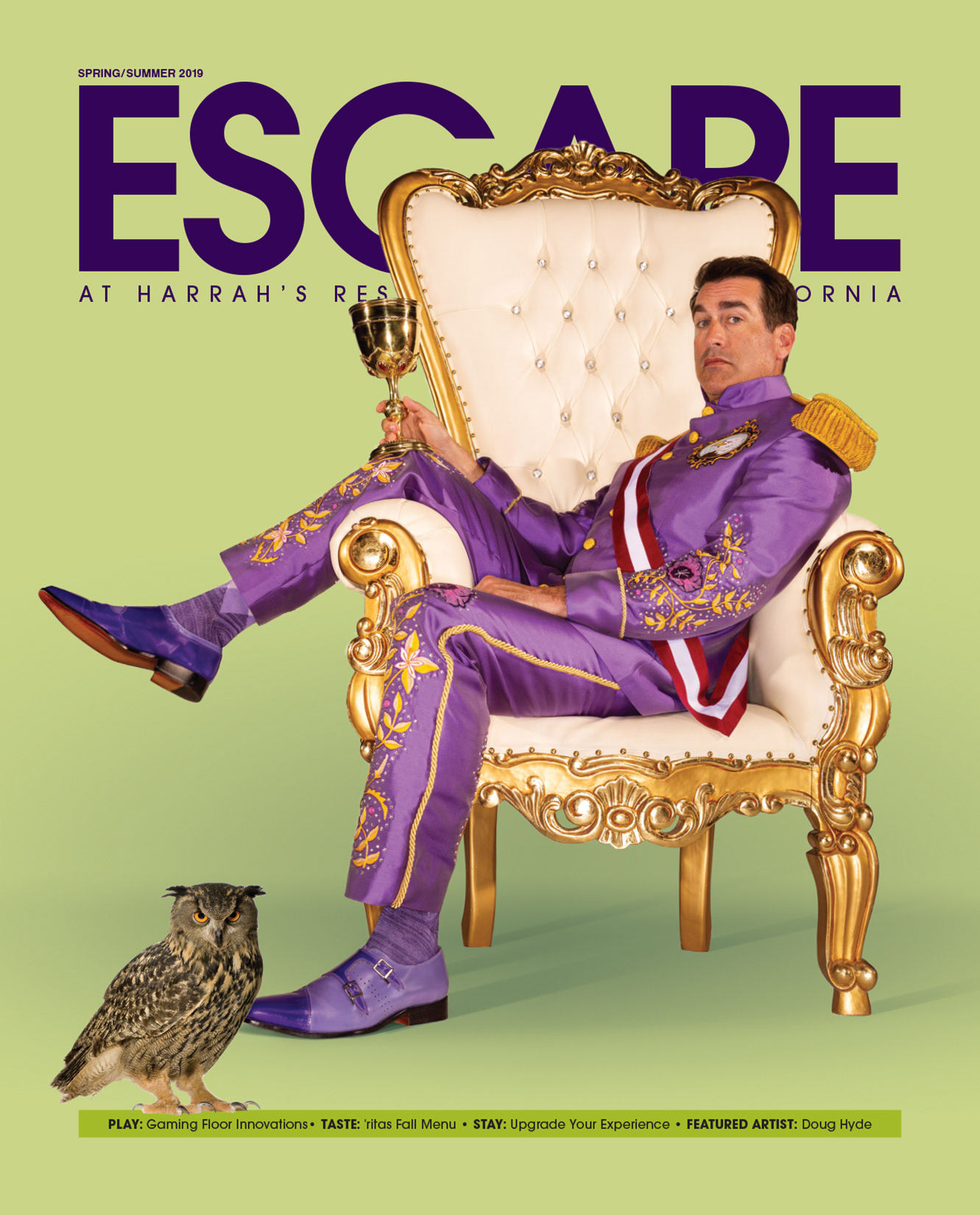
We started with making concepts with images that showed his true character as a comedian and a personality of Harrah's. This was one of the concepts which we didn't feel was enough.
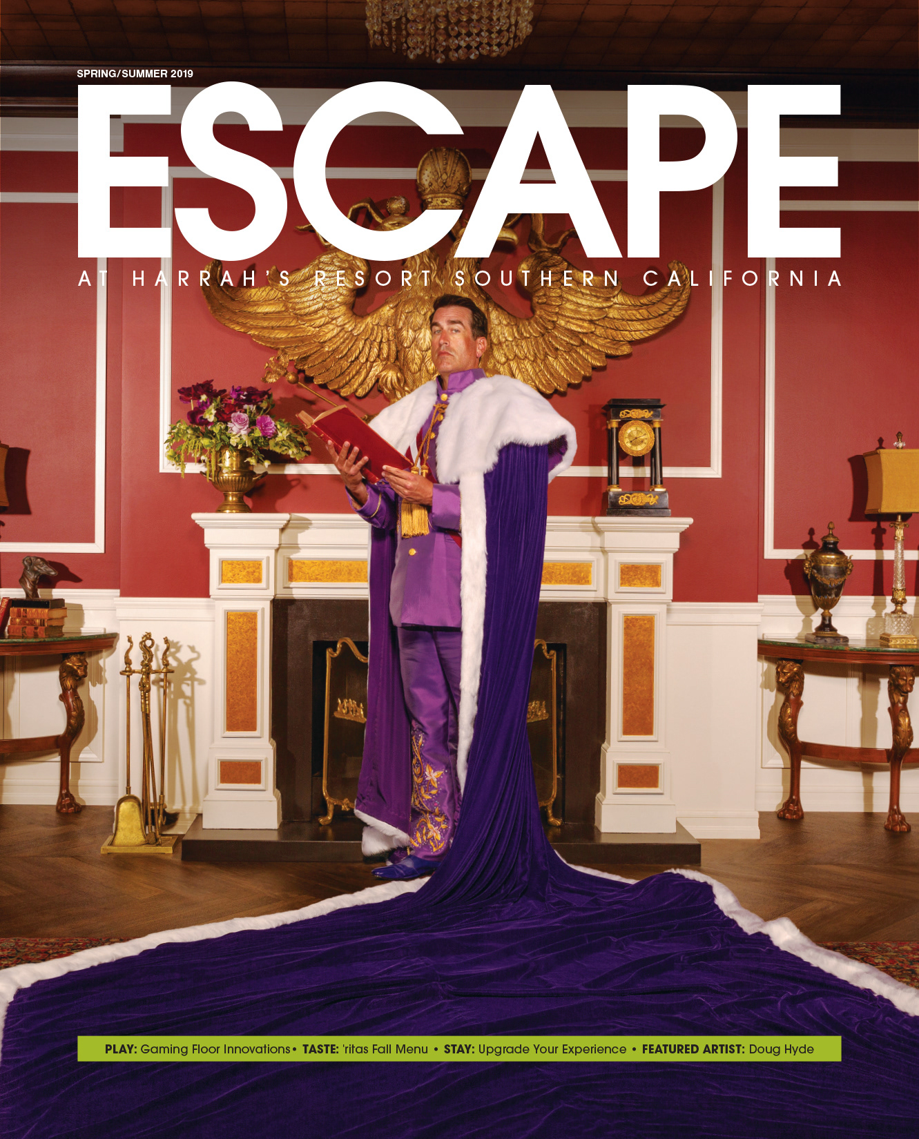
Then we tried other images with more of his formal attire (cape) and in a setting that made him feel more "Mayorly"
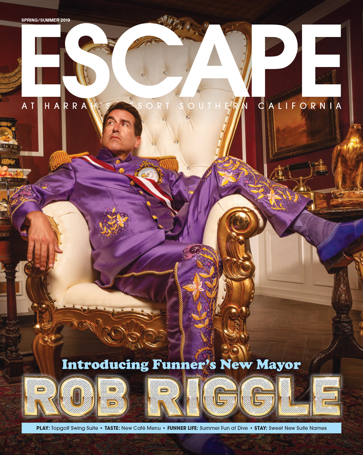
That didn't work either so we tried more of a "Bling" typography style to give it more flavor. This was the first concept.
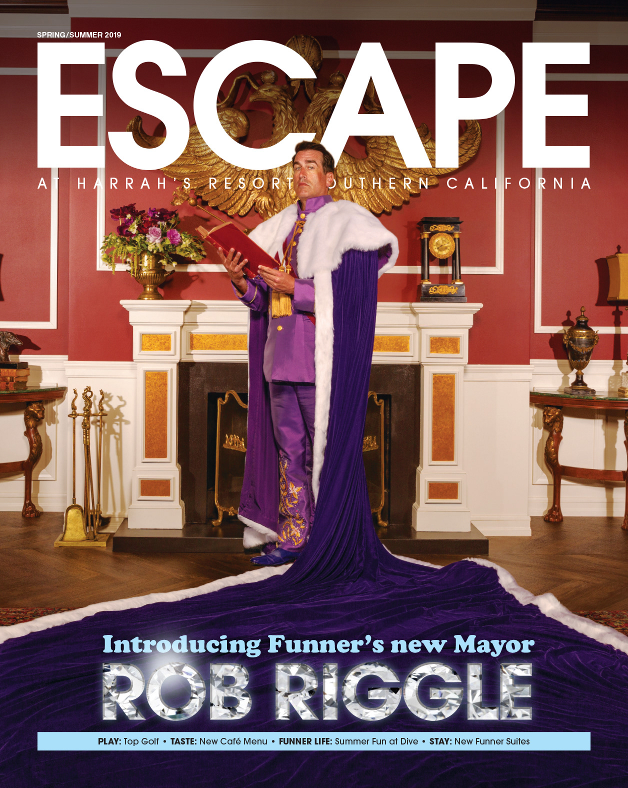
At the end of it we landed with the image that's at the start. The image has attitude, flavor, and humor. The typography is perfect as its more readable, and fits the vibe of the cover image.